
A11y introduction
Press 'Space' to continue
Press 'n' to show/hide notes
Press 's' for speaker mode
Introduction
Different kind of accessibility
- Font
- Color / contrast
- Screen reader (aka Voice Over on iOS)
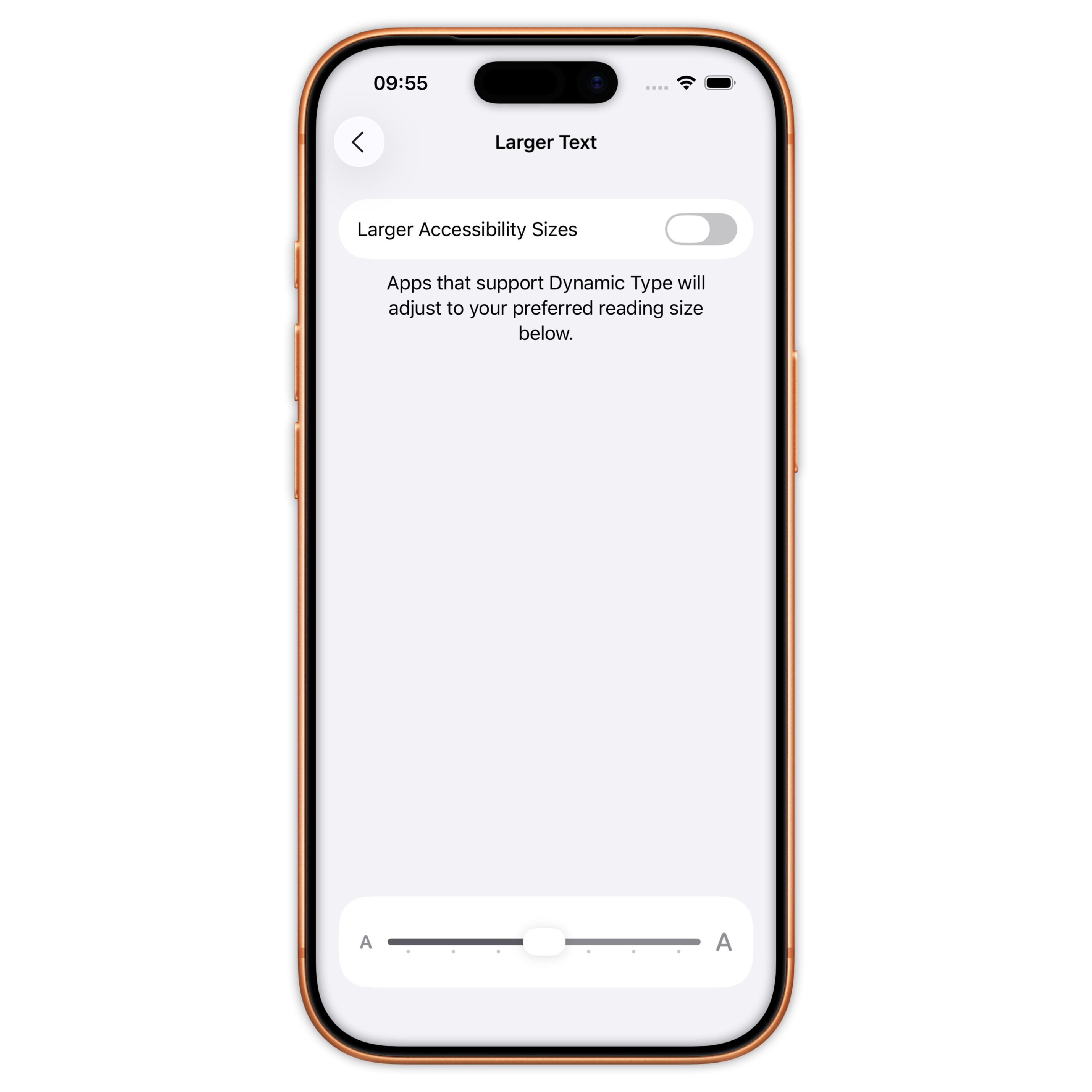
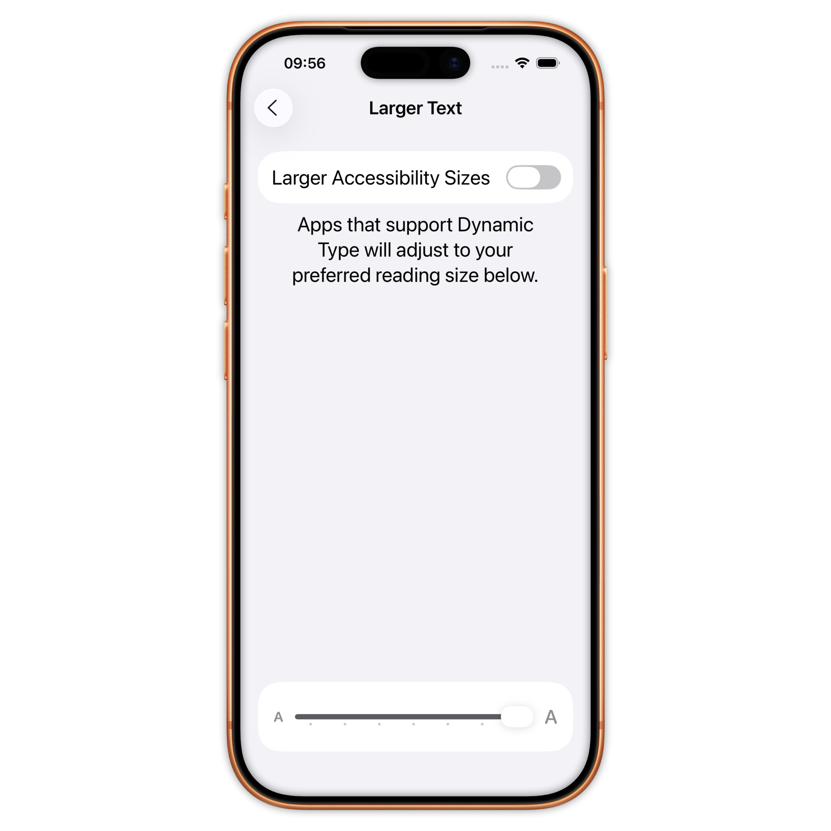
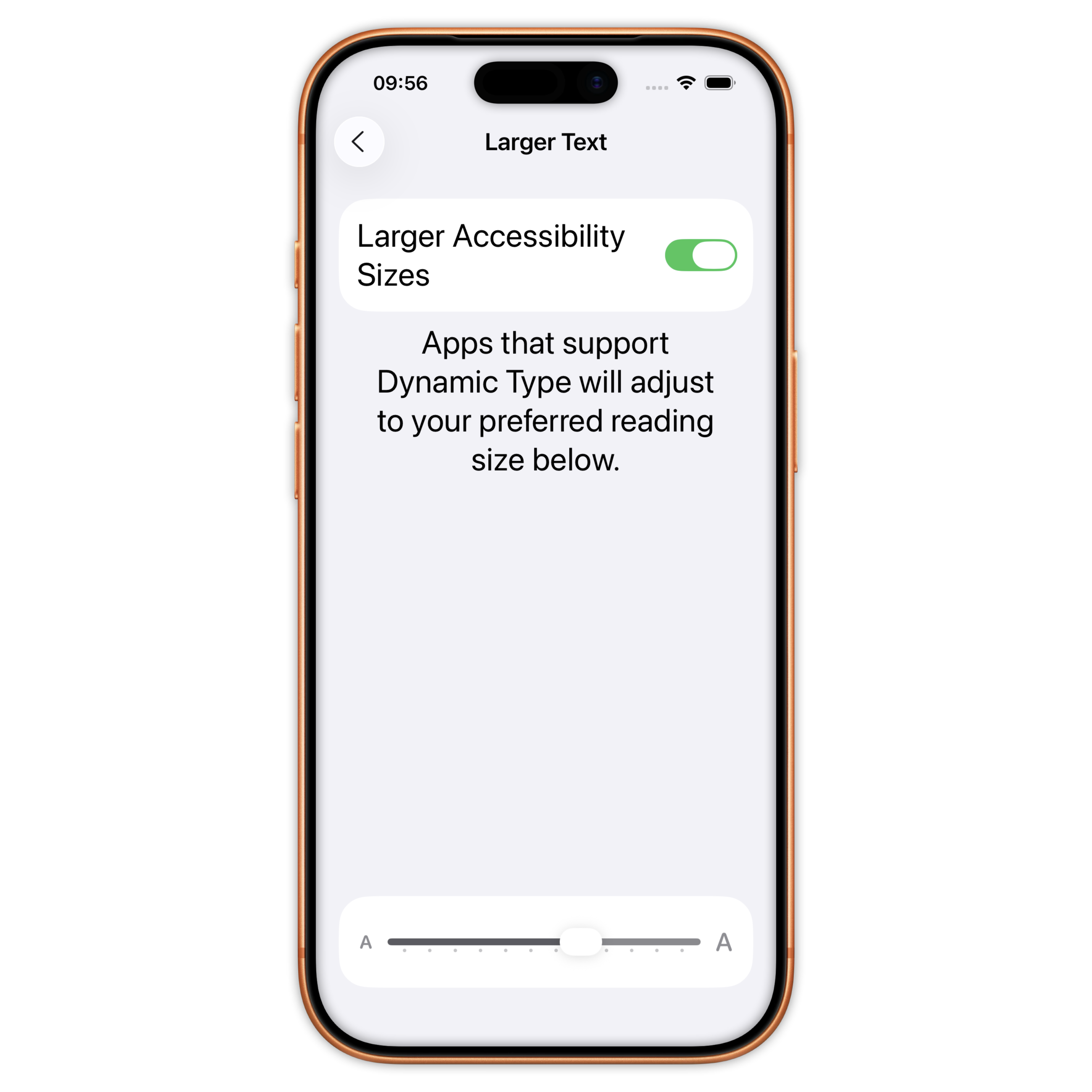
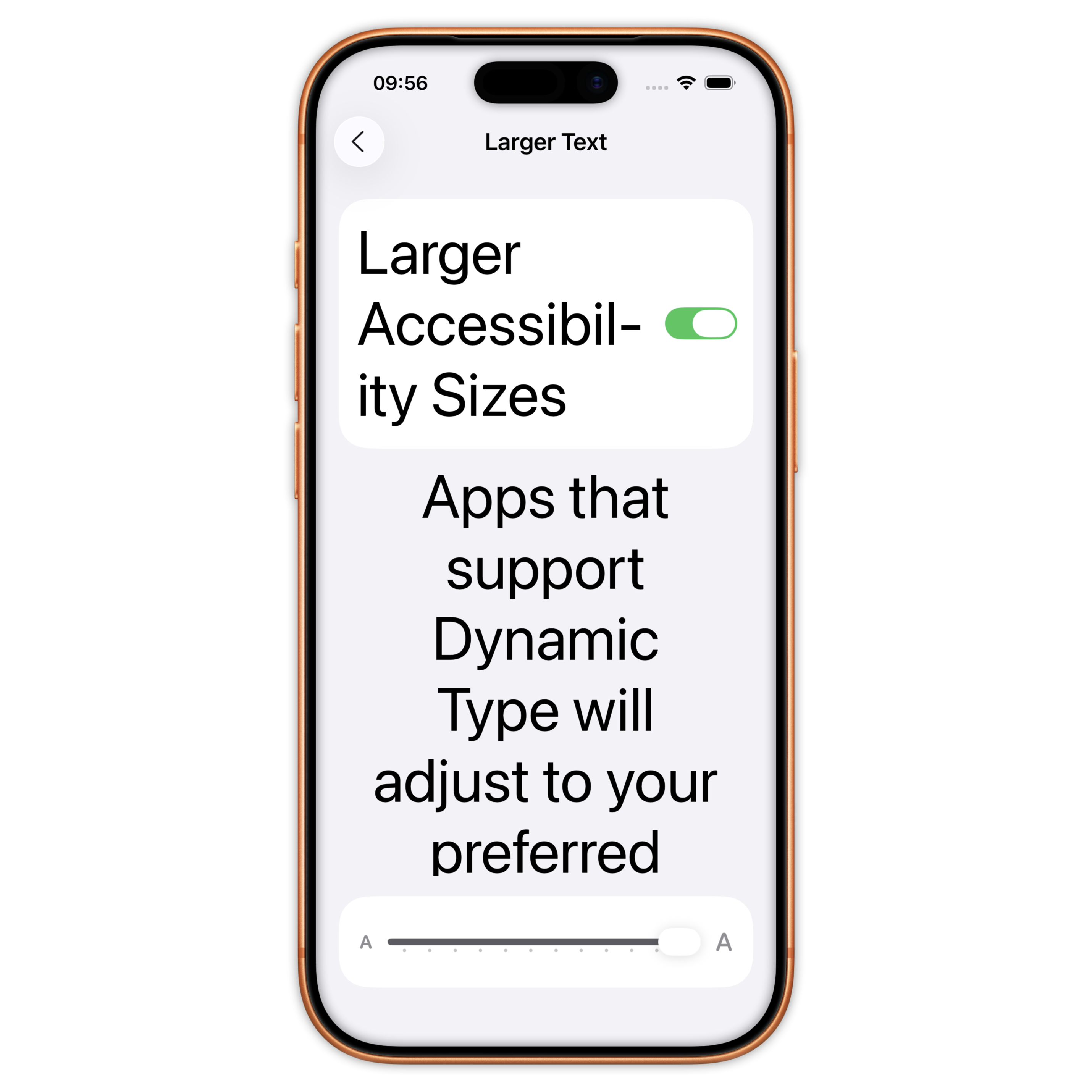
Different level of accessibility
Large(default) / XXXL / Accessibility Medium / Accessibility XXXL
Font size and dynamic type (UIKit)
Scaled font based on text style
public extension UIFont {
  static let title = UIFont.preferredFont(for: .title1)

  static func preferredFont(for style: TextStyle) -> UIFont {
    let metrics = UIFontMetrics(forTextStyle: style)
    let descriptor = UIFontDescriptor.preferredFontDescriptor(withTextStyle: style)
    let font = UIFont(descriptor: fontDescriptor, size: fontDescriptor.pointSize)
    return metrics.scaledFont(for: font)
  }
}
Font size and dynamic type (SwiftUI)
Scaled font based on text style
public extension Font {
  static let title1 = UIFont.title.scalableFont(relativeTo: .title1)
}
private extension UIFont {
  func scalableFont(relativeTo: TextStyle) -> Font {
      Font.system(Font.TextStyle(uiTextStyle: relativeTo))
  }
}
Font size and dynamic type (SwiftUI)
Using custom font
private extension UIFont {
  func scalableFont(relativeTo: TextStyle) -> Font {
    let traits = fontDescriptor.object(forKey: .traits) as? [UIFontDescriptor.TraitKey: Any]
    let baseFontSize = UIFontDescriptor.preferredFontDescriptor(withTextStyle: relativeTo).pointSize
    let weightValue = traits?[.weight] as? CGFloat ?? UIFont.Weight.regular.rawValue
    let weight = UIFont.Weight(rawValue: weightValue)

    return Font.custom(
      fontName,
      size: baseFontSize,
      relativeTo: Font.TextStyle(uiTextStyle: relativeTo)
    )
    .weight(Font.Weight(uiFontWeight: weight))
  }
}
Font size and dynamic type
Mapping between SwiftUI and UIKit
private extension Font.Weight {
  init(uiFontWeight: UIFont.Weight) {
     switch uiFontWeight {
     case .ultraLight: self = .ultraLight
     case .thin: self = .thin
     ...
     default: self = .regular
     }
  }
}

private extension Font.TextStyle {
  init(uiTextStyle: UIFont.TextStyle) {
     switch uiTextStyle {
     case .largeTitle: self = .largeTitle
     case .title1: self = .title
     ...
     default: self = .body
     }
  }
}
Font size and frames
- Prevent strong hardcoded frames:
- Use of minHeight / minWidth instead of height and width
- Use of automaticDimension for UITableView
- Ask if decorativ element needs to be shown for each accessibility
- Scale your metrics
Font size and frames
Detect accessibility mode
@Environment(\.dynamicTypeSize) var dynamicTypeSize
...
dynamicTypeSize.isAccessibilitySize // true starting accessibility medium
Font size and frames
Scaled metrics
@ScaledMetric private var cellHeight: CGFloat = 42
Font size
Tool: Rocket Sim
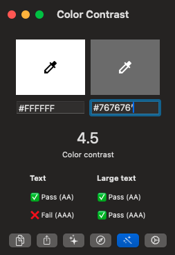
Color / contrast
Contrast ratio should be over 4.5
We can use the Accessibility Checker tool
Screen reader
We can use Accessibility Inspector tool from XCode
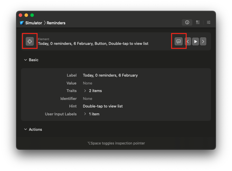
Screen reader
There are 3 main elements:
- Accessibility label
- Decorative / acessibility element
- Traits
Screen reader
Accessibility label: description that the screen reader will read if provided.
If not set, the screen reader will read the default one if exists or the ones from subviews
Screen reader
Accessibility Element:
You can remove some elements from the screen reader using AccessibilityElementHidden.
Another way to do it for images is to use the decorative parameter.
      Image("my-image").accessibilityHidden(true)
      Image(decorative: "my-image")
Screen reader
Accessibility Trait:
You may need to add traits on elements, for instance on clickable image to be considered as a button.
These are the more common traits to use:
- button
- header for titles or sections
- link (can be a real link text or a button that will open another app)
.accessibilityAddTraits(.isButton)
Link